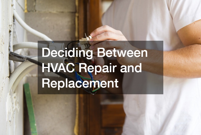
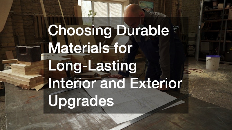
a woman creating font in her laptop

Are Timeless Typefaces Garamond and Helvetica in Peril?

Fonts and typefaces are ubiquitous in the modern world. We barely notice the amount of effort it takes typographers to brainstorm and design them. There are a few times when we take the time to consider fonts. Making wedding invitations, publishing manuscripts, and printing posters are all times when our choice of typeface matters.

We now have access to dozens of fonts, from the practical Arial to the much-ridiculed Comic Sans. But once in a while, a font comes around that changes the world of typography. Two such fonts are Garamond and Helvetica. These are institutions of type, recognized by publishers and graphic design studios all over the world.

But will these timeless titans of typeface still have a place in the decades to come?

Their Origins

Claude Garamond created the font, which would eventually bear his name in 1530. His punches, the slender metal rectangles with the original letters carved on their ends, were scattered throughout Europe after his death. These punches served as inspiration to many designers in the centuries to follow, giving rise to the Garamond family of fonts.

In 1950s, Swiss companies were looking for a font that would embody their country’s neutrality and modernity amid the Cold War. Max Miedinger, a Swiss type designer, introduced his creation, Neue Haas Grotesk, in 1957. The font was renamed Helvetica, after the Roman name for Switzerland, in 1960.

The fates of their creators were as different as the eras of their conception. The design community hailed Max Miedinger as a creative genius who revolutionized typography. Claude Garamond died in poverty, his contribution largely forgotten until the 20th century.

Their Impacts

Garamond has been described as elegant, regal but still readable. Its utility and elegance allowed it to survive for over 400 years and has inspired a whole family of related fonts. Designers and publishers over the centuries appreciate Garamond for the touch of class and Old World charm it lends to texts, without being unreadable. Using Garamond on public documents could save the United States government $370 million, as it uses smaller amounts of ink.

Helvetica truly took the world by storm at the time of its release.  Multinational companies, such as Coke, Nestlé, and American Apparel, used it for their logos and ad campaigns. New York City adopted the font for its public signage and the city’s subway stations and street signs are still iconic today. The font is instantly recognizable, if not immediately nameable.

Their Downfalls

design across different gadgets

Designers are not using Garamond and Helvetica as often these days. The main issue for Garamond is that it does not translate well in digital formats. The subtle serifs and details of the font don’t appear clearly on screens. Pixel and screen technology haven’t advanced enough to allow Garamond to be as readable on them as other fonts. In an increasingly paperless society, this could spell an end to Garamond’s four century legacy.

The proliferation of Helvetica has made it pedestrian. Its heavy usage among corporate entities has given it a connotation with conformity, blandness, and uniformity. Designers today tend to explore more creative and unique fonts to incorporate into their designs. Helvetica has gone from a font that said so much to a font that says nothing because  of its overuse.

Debates have arisen between typographers whether or not these typefaces are still relevant in the 21st century. Print publishers still use and favor Garamond because of its trademark style. An independent filmmaker released a movie in defense and appreciation of Helvetica.

Despite their flaws, these two typefaces have plenty of fight and utility in them. They still have plenty to “say,” and, given their timeless appeal, they could have centuries in which to say them.

Spread the love
Scroll to Top